
Hi guys!
As CCEO (Cat CEO) of this website, for some time now I have been looking for the best way to communicate data graphically, both internally to our staff and for the articles we prepare for you. It already seemed all seen and seen again and, therefore, super boring … when I had the intuition to stop squeezing my brains and go to my humans to ask opening a tuna can. And here, like a flash, the most innovative idea that I could have imagined up to that moment during all my investigations sparked in my mind, clearing up any doubts: I had to make the TUNAGRAMS!
I cannot describe my enthusiasm after having that happy intuition, it will suffice to say that I left the tuna for a moment to go and confer with my humans and tell them this fantastic idea.
Obviously they were thrilled and, at that point, my work as a cat-magnificent inspirer, supreme genius inventor of amazing creations, was over: I could quietly go back to my tuna can.
I let them produce, going to dispense my beneficial purring from time to time to motivate them. In truth, also to check that everything was going smoothly, without jams due to stagnation of the project … not that my humans are lazy, that was absolutely not the meaning, and I admit that perhaps I could have expressed myself better… Let’s say that in all projects it happens to run aground in some rock and I was always ready to throw them a rope to free them.
After a month of hard work, I am pleased to present you the first tunagrams we created (I call them “the first” because new ones could surely come out![]() !).
!).
I almost forgot: the background of the tunagrams is orange (because it’s my favorite color!), but you can also choose the white one.
Initially, the “ScatterTuna-gram” was born, essentially a scatterplot, that is a graph in which highlighting the relationship between two continuous numerical variables x and y (note: a continuous numerical variable is a variable represented by numbers, integers or decimals, often deriving from measurements).
To give you an example, I propose the ScatterTuna-gram of the hypothetical relationship that I expect there will be between the increase in the quantity of my tuna cans in relation to the increase in the number of articles that we will publish on Astro Artù: the graph clearly shows a linear and positive relation between the two variables.
The ScatterTuna is equipped with a legend, which you can insert at the point that you like best in the chart, with titles and horizontal lines that can be added if you need to view a limit value. If you scroll with the pointer over each point (represented by a tuna), its value will be displayed.
Then I propose to you what is perhaps my absolute favorite: the “TunaCan-gram”, because it is round like the little tuna can and contains other tuna fishes: nothing better to wish for a greedy cat like me!
It follows the classic donut chart, so it is the representation of the proportion of observations for each category of data made one hundred the sum of all observations, but in a “gattastic” version, because the donut cart sectors have been converted into tuna. Also in this case, you have the possibility to insert the legend, the title, and to view the value of each single tuna by hovering over it with the mouse. I advise you not to exceed with the categories to be graphed, as you could create a graph that is not very informative and too confusing.
Below is an example, in which I have best organized the free time of my humans.
The Arthurian version of the bar chart could not be missing, which we called “TunaBar-gram”.
Normally, this chart is used to compare quantities for each category using bars to represent them. The height of the bars is related to the value of the reference category. As with the other graphs, you can enter titles and add a label above each bar with the values assumed by each category.
If the categories represent a defined time frame (eg: a day, a week, a month, etc.), observing the trend of the bars can also give us information on the trend of the quantity examined over time. Or, as in the example below referred to me (maybe I’m too Artù-centric?), You can simply monitor the level of your own food supplies.
The super worrying thing about this chart is that they are practically without plaice soups, which I love! And this gives me the opportunity to make you understand how the graph must serve as a basis for making decisions, establishing actions. Here the only possible action is to instantly send my humans to buy more plaice soups!
Now I will introduce you to a graph that probably many of you have not seen yet, but which is very useful for the representation of numerical data, often divided into categories, of which you want to visualize the distribution, the central trend (median) or identify anomalous points (the so-called “outliers”). I am referring to what we have re-baptized as “TunaPlot-gram”, but which whose real name is boxplot.
It’s quite complex, in fact, but I will show you below how to read it (I will not bore you exaggeratedly with the statistical explanations, you can always write to me or deepen through your research). Imagining to order the data in ascending order, the parts that make up a Tunaplot-gram (and the classic boxplot) are:
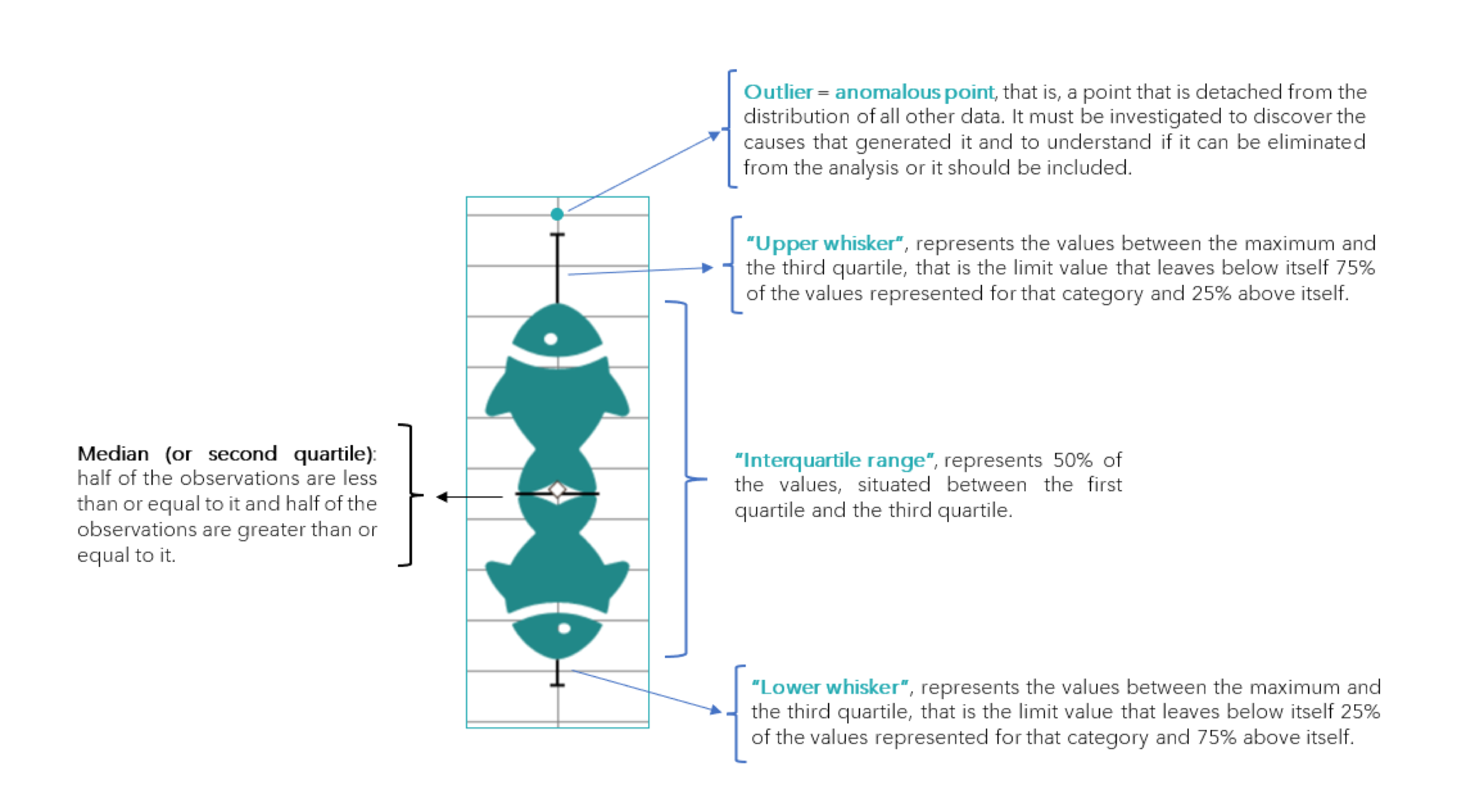
I specify that the rhombus between the tails of the two tuna represents the average of the values.
The extension of the whiskers or of the two parts of the interquartile range separated by the median, as well as the position of the median itself, characterize the distribution of the data. Mean and median coincide if the data follow the so-called normal distribution.
The passage of the pointer brings up a summary of the data of the tuna chosen, that contains: third quartile, median, average and first quartile.
The example below shows the measure of the time it takes to get up, my reactivity in a nutshell, depending on the activity I have to carry out.
Let’s now move on to a simpler graph, the tuna-version of the line diagram: the “TunaLine-gram”.
It is a graph that simply indicates the trend of a numerical variable (on the y axis) over time or through various points defined by the user (x axis).
You can insert multiple series in the same chart, including titles, legend, lines for a possible limit value and labels of individual tuna.
In my dreams (which I hope will soon come true) the TunaLine-gram of the amount of the “tuna budget” should be roughly the same as the one I show you below in the left graph, while in reality today the situation is the one proposed in graph on the right.
Even if the data is what it is, I do not give up and I do my best every day to reach my goal.
We have arrived to the last of the tunagrams created so far by Astro Arthur, the “TunaPareto-gram”. Some of you have probably already heard of the Pareto chart, a descending bar chart correlated by a line chart representing the cumulative percentage. Generally it is used to visualize the main effects of various components on a phenomenon (eg: the taste of best-selling cans in a shop, etc).
To further detail what I have explained, I’m including a graph showing hypothetical sales of a pet shop by taste of cans/ pouches, if all customers had my tastes. The period considered is that of one month and the unit of measurement is the number of cans or pouches.
Perfect guys, I’d say that’s all for this article: I’m delighted to have shared our creation with us and I trust that this new form of representing data can entertain you here on our AstroArtù.
Meow bye-bye!
P.S .: As CCEO, I am happy to announce the release of new exciting emojis, the Piccicons !!!
AstroArtu.Studio CCEO